Original Art by Ann Enyon. Acrylic on canvas, 30’x30″. Now available via Tartooful.
Autumn 2018
Well, Hello, Beautiful…
new treasures and treats from Trollbeads in our ONLINE SHOP
live artfully!
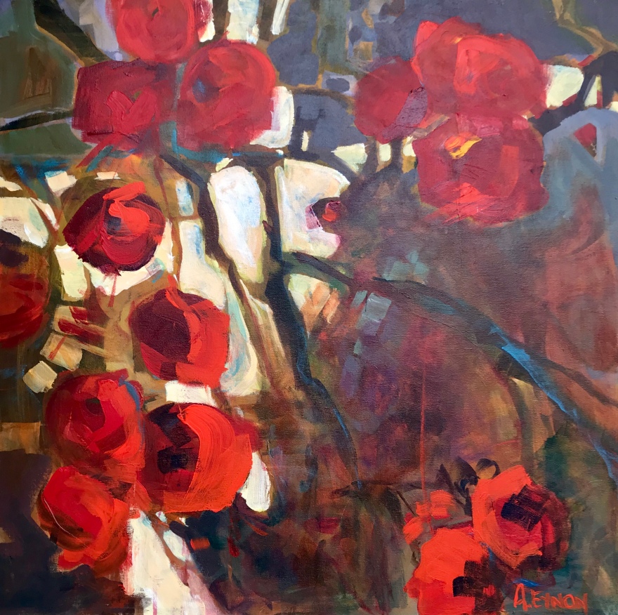
Original Art by Ann Enyon. Acrylic on canvas, 30’x30″. Now available via Tartooful.
new treasures and treats from Trollbeads in our ONLINE SHOP
